You’ve invested in a quality projector. The setup looks right. But something is still off: whites have a bluish tint, skin tones look unnatural, or dark scenes feel flat and muddy.
Most people blame the projector. But in the majority of cases, the real culprit is the relationship between color temperature and projection screen color accuracy.
Your projector is only one half of the equation. The other half is your screen material. If it isn’t reflecting light in a spectrally neutral way, it is distorting the image your projector works hard to produce. This guide explains color temperature, how screen materials affect it, and how to achieve accurate, true-to-source color.
What Is Color Temperature in Projection?
Color temperature, measured in Kelvin (K), describes the visual warmth or coolness of a light source. Here is the scale that matters for home theater:
- 2700K–3000K: Warm white (candlelight, incandescent bulbs)
- 3500K–4100K: Neutral white (office lighting)
- 5000K–5500K: Daylight (midday sun)
- 6500K (D65): Standard white point for video and cinema
- 7000K+: Cool white (overcast sky, some LEDs)
In professional video production, 6500K — the D65 standard — is the universal reference for color grading. Every film, TV show, and streaming title is mastered at this point. When your projection system accurately reproduces 6500K, you are seeing content exactly as the director intended. Any deviation means the image is no longer accurate.
How Screen Material Affects Color Accuracy
A projection system works as a chain: Projector Output (6500K) → Screen Material → Final Image
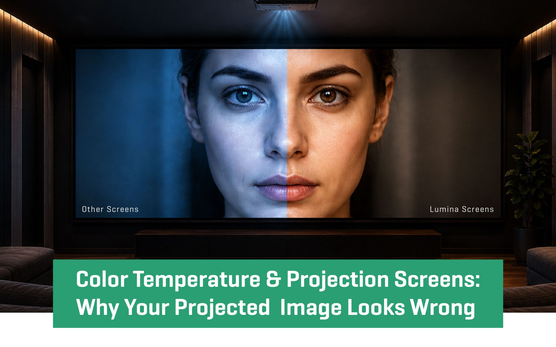
Most projectors output light close to 6500K in cinema mode. But the color temperature your eyes receive depends on how your screen material reflects that light. For accurate projection screen color accuracy, the screen must be spectrally neutral — reflecting all visible wavelengths equally, without bias toward blue, red, or green.
When the screen is not neutral:
- A blue bias shifts the image cooler, making whites look ice-blue and skin tones appear pale
- A warm tint pulls the image below 6500K, making whites look cream-Colored and reds oversaturated
- Uneven spectral reflectance distorts color balance across every frame
This is why two identical projectors produce different results when paired with different screen materials. The projector is the same. The screen makes the difference.
Projection Screen Materials Compared: Color Performance
Matte White (Gain 1.0–1.1)
The reference standard for projection screen color accuracy. Spectrally neutral reflectance with minimal color temperature shift. Best for dedicated home theaters and color-critical setups. Requires good ambient light control.
High-Gain White (Gain 1.2–1.8)
Increases brightness but optical coatings can emphasise blue wavelengths, shifting the image 50K to 200K cooler. Useful for underpowered projectors, but pair carefully and calibrate to compensate.
Grey (Gain 0.8–1.0)
Absorbs ambient light to improve contrast and black levels. When formulated with uniform spectral absorption, can be very color-neutral. Best for contrast-priority setups with a powerful projector.
ALR — Ambient Light Rejecting
Rejects off-axis ambient light while accepting on-axis projector light. Effective for living rooms and bright environments. Color accuracy depends heavily on coating quality — budget options can vary by 200K to 400K depending on viewing angle.
Why Screen Material Is Critical for Accurate Color Reproduction
Skin tones: The human eye is highly sensitive to even small inaccuracies. . A 200K color shift is immediately visible on a face — this is always the first thing audiences notice when color temperature is wrong.
White balance: Whites should look neutral, not cream-Colored or ice-blue. A warm-tinted screen makes bright whites look off-yellow. A cool-biased screen makes snow look fluorescent.
Color saturation: When color temperature shifts, the red, green, and blue balance changes. Reds can drift orange, blues can look purple, and the entire color palette becomes unreliable — even in scenes that aren’t obviously colorful.
Common Mistakes That Ruin Projection Screen Color Accuracy
- Assuming all white screens are neutral: Not all white screens are spectrally balanced. A budget screen can shift your image by 300K to 500K — invisible on a blank surface but obvious on faces and whites. Always request spectral reflectance data before purchasing.
- Prioritising gain over color neutrality: High-gain screens often introduce a cool bias. Pairing one with a projector already running above 7000K makes the problem worse, not better.
- Ignoring room lighting: Warm bulbs at 2700K shift your perception of the projected image. Dim room lights for accurate viewing, or use 6500K bias lighting positioned behind the screen.
- Skipping calibration: Factory default modes — Standard or Dynamic — typically run at 7000K to 8000K. Switch to Cinema or Movie mode immediately after installation. For systems over $3,000, measure color temperature at the screen surface with a colorimeter ($150 to $250).
How to Choose the Right Projection Screen for Color Accuracy
- Full darkness (dedicated theater): Matte white, gain 1.0 to 1.1. Maximum color accuracy, widest viewing angle.
- Partial light control (living room): ALR or light grey, gain 1.0 to 1.3. Balances color accuracy and ambient light resistance.
- Bright environment: ALR screen with higher gain. Prioritise visibility, calibrate for color where possible.
- Wide seating arrangement: Choose a screen rated at 140 to 160 degrees viewing angle. High-gain screens produce a dimmer, color-shifted image for side viewers.
Conclusion: Color Accuracy Starts With the Right Screen
Color temperature is the defining factor in whether your projected image looks right. Your projector can be perfectly calibrated, but the final result depends on what happens when light hits your screen. A spectrally neutral screen delivers accurate 6500K D65 reproduction, reliable skin tones and white balance, and a stable foundation that simplifies calibration.
This is where Lumina Screens differentiates itself. With over six decades of cinema manufacturing expertise through parent company Galalite, every Lumina screen is tested using spectroscopic analysis and ships with measured color temperature data. Our 15-year color stability guarantee means the performance you calibrate today is the performance you keep.
The screen is the final component in your color pipeline. Choosing the right one means the image you see is not altered — it is accurately delivered.
What color temperature should a projection screen reproduce?
For home theater and video content, the target is 6500K — the D65 standard used in professional Color grading. This is the reference point at which all films, TV shows, and streaming content are mastered. A screen and projector combination calibrated to 6500K will reproduce content exactly as the director intended.
Does screen material affect color temperature?
Yes, significantly. A screen material that is not spectrally neutral — meaning it reflects some wavelengths more than others — will shift the Color temperature of everything projected onto it. A blue-biased screen can push your image from 6500K to 7200K or higher. A warm-tinted screen can drop it below 6000K. This is why choosing a spectrally neutral screen material is as important as calibrating your projector.
What is a spectrally neutral projection screen?
A spectrally neutral screen reflects all wavelengths of visible light equally across the 380nm to 780nm visible spectrum. Its spectral reflectance curve is flat — no peaks or dips that favour certain Colors. Matte white screens at gain 1.0 to 1.1 are typically the most spectrally neutral option available for home theater use.
Is a matte white or grey screen better for color accuracy?
Both can be Color-accurate if properly formulated. Matte white screens at gain 1.0 to 1.1 deliver the highest Color neutrality and are the reference choice for dedicated home theaters. Grey screens improve contrast and black levels by absorbing ambient light, and when formulated with uniform spectral absorption, they maintain good Color accuracy. The right choice depends on your room’s lighting conditions and projector brightness — not on Color accuracy alone.
- Date - May 13, 2026